Date Added: 15.07.2021
Mins Read: 2 mins
Using Space
in Print Marketing
Effective Use of Space in Print Marketing
As catalogue design specialists, we know more than anyone the importance of space in print marketing.,
So if you’re baffled why using space correctly is important – join us – as we delve deep into how space can take print to the next level.
However if you aren’t familiar with this, ‘white space’ is an element used in all forms of design work. It’s the term given to an unoccupied area on a piece of printed creative.
There are two different kinds of white space in print marketing. Active, which references any space intentionally placed into the design or page. And passive, related to any space which is there but not of use functionally like the gaps between words for example.
Our in-house CHS catalogue design guru James Harvey, handles the spread design elements for the much-loved Lakeland catalogue. He urges marketeers everywhere not to overlook the power of white space. And embrace the value it can add to product spreads.
Contrary to popular belief, James says that white space isn’t ‘empty selling space’. But more a tool brands can use to enhance their offerings and reader experience. A common misconception is that it should be used as a space for extra content. When in reality, space has a huge role in the overall effectiveness of the finished spread.
How? Well lucky for us, James has shared his expertise. Providing three ways in which white space can improve a design spread:
1. The Reader Journey
Using white space tactically is a nice method of guiding the reader to where and how you’d like them to look. This is because it adds an element of focus to the page like acting as a “guide for our eyes” – as if you’re walking down a shop aisle yourself. White space can be a great counter balance to high-dense spreads too since it adds a change of pace to how a catalogue is read.
2. Luxurious Print Quality
Have you ever seen a press advert for Apple? Of course you have!
Apple is a prime example of how space in print can be used to convey quality. This is because the right use of active space adds a degree of calm and sophistication to a spread. It reduces noise and allows the reader to focus in on just one thing – how great the products are as sometimes – less really does mean more!
3. The Product Hierarchy
In a cluttered space full of products, deals, roundels and noise, it’s easy to get lost amongst too many messages – and too many messages might as well be no messages. White space allows a brand to really showcase the most important aspects of a spread like the products or offers by giving them breathing space, especially in hero areas.
This means brands can use white space to upsell the most important products through controlling the focal points readers will notice first or the most.
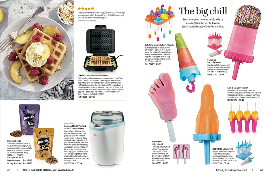
We’re very proud of the work we do so we’ve also included some of our latest Lakeland Summer spreads.
Who’d have thought that saying nothing could do so much?
Click here to see more of our work with Lakeland.


Our
Awards
B2B Campaign Winner 2024

Sponsorship Winner 2022

Best Paid Social Winner 2021

Best Use of Video Winner 2021

Highly Commended - PMAs 2022

Best Finance Campaign 2021

Best Financial Services
Campaign Winner 2020

Best Financial Services
Campaign Winner 2020

Rated 9.2 out of 10
from our clients

Marks & Spencer Food Portraiture 2nd Place 2020


